Sunday, September 4, 2011

His and Hearse; Going Out In Style


recent model Cadillac SUVthe Cadillac Escalade hearse is very similar to the big black Cadillacs people use for getting to work and shopping


I've noticed an awful lot of those bulky Cadillac Escalades around the city. In spite of their scale and capacity, inevitably they are occupied by only the driver.

The trend has been around for a few years, but a great many of these vehicles continue to be black. For the past 50 years that I've been around, "black Cadillac station wagon" has been synonymous with "hearse." Personally, having the choice, I would prefer not to be transported in one of these hearses, but perhaps my sensibility is overly delicate.

Apart from that, I am amazed that the drivers of these large vehicles seem to be unaware of any environmental impact in terms of manufacturing, fuel consumption, dissipation of heat, and wear and tear on roads. They also take up a lot of unnecessary space in a crowded world. I am at a loss to understand why people wish to make such grand statements at a time when more than ever, we must be aware of preserving resources and space.

Recently I watched the wonderful 1962 film, "The Light in the Piazza," with Olivia de Havilland. In one scene, she is driving along a verdant country road in Italy with Rossano Brazzi. The little Italian two seater convertible (perhaps a Fiat or Lancia) was incredibly chic, and almost humorously diminutive. In the film, these two characters are wealthy and worldly, and yet they looked stylish in what looked almost as tiny as a Smart Car.

What happened to modesty and charm in how we present ourselves in dress, deportment, transportation, and habitation? What happened to any sort of conscience in terms of caring for others and the world we live in?

Perhaps the drivers of black Cadillac Escalades and similar behemoths feel that they are going out in style. Personally, I'll leave the journey in the black hearse until my last earthly ride.

Saturday, April 2, 2011

The Ritz-Carlton Toronto; This is a Ritz?

the original and first Ritz, in Paris, opened over 100 years ago; it is on Place Vendome, and has an 18th century dressed limestone facade; photo SwF the entrance of a slightly later Ritz, the one in Madrid, done in the 18th century style, dressed stone architecture; it is also over 100 years old; the meticulous plantings in profusion, the grand historic revivalist style, and ambiance of luxury are what made the name world famous; others rushed to emulate the distinctive style; photographer unknown the south facade of the new Ritz-Carlton Hotel in Toronto; these rooms face Toronto's iconic CN Tower the main entrance of the Toronto Ritz-Carlton faces north and the massive brackets are also clad in grey resin or enamel panels; the Brutalist aspect of these supports is rather looming as one approaches the front doors; the effect is cool and dark the north facade of the Toronto Ritz-Carlton; the building is in a revival of modern International style, clad almost entirely in glass; the style has been ubiquitous for so long that it has become all but invisible although the hotel is situated in a very dense urban environment, a small sliver of park to the north of it offers much needed natural relief beautiful, 30" large bronze maple leaves set in the Perlato Sicilia marble floor of the lobby another view of the huge bronze leaves detail of a staircase in the lobby, note the different finishes of wood; the lighter wood is a very light, satin finish veneer, the back wall is of rough hewn, dark planks or narrow panels set horizontally; the railing is capped with a highly polished brass or bronze material this sculpture in the lobby is of engineered stone; considering that vast areas of Canada are covered by the Canadian shield, real stone such as rich red Quebec granite would have been more fitting; the art is typical of the lobby in the hotel; it is retiring and unemotional enough to be quickly forgotten this back patio of the Ritz-Carlton has a nice southern exposure but the appointments seem dull, reminiscent of institutional outdoor eating areas of schools and hospitals discreet flower arrangements in the lobby; in a country that has just gone through a long winter, these strike me as autumnal in colour amoeba like fixture in the lobby is strung with rows of crystal orbs; the effect is somewhat like a dazzling cinema marquis or Vegas casino sign detail of lobby decoration; the upholstered chair is very similar to circa 1962 modern ones and arm rests have been dispensed with; large expanses of light wood veneer wall covering, strange juxtapositions of scale and material in the selection of furniture give a random, unharmonised effect bar off the lobby; tubular steel chairs evoke the cheapest, mass produced kitchen sets of the 1960s; for international travellers, red lights have questionable associations and I am puzzled by this selection alcove of the lobby; wood veneer wallcovering, angular modern chairs and an ugly piece of dark brown wall art depicting a row of plants with a cross section of the earth as in an elementary school Science diagram; loose cushions in all chairs prevent one from sitting back and relaxing

Two years ago, I was excited to learn that Toronto would be getting a Ritz-Carlton. I've always been interested in grand luxe hotels and how they welcome people and make them feel pampered away from their everyday lives. I looked forward to having our own Ritz and also to my first viewing of it. Over the past six months, I've tried on several occasions to contact the hotel, in anticipation of the scheduled opening. E-mails to different departments were left unanswered, and I thought perhaps that in the rush to prepare on schedule, they were overlooked. As the opening date drew closer, I contacted management who apologized and said that they would arrange a visit. A date was proposed but unfortunately I did not hear back.

In my experience of over three decades with some average and some great hotels in North America and Europe, this is the worst example of service and communication I've experienced from any hotel, let alone one that is supposed to be five star. In terms of service, I've given up hope on the Toronto Ritz-Carlton, by both their public relations departments and management.

This aside, my intention was to study the design of the hotel rather than the service, but I have been disappointed with both areas. The exterior of the building is clad in glass, in a revival of the International style. There is nothing unattractive about the exterior, but there is nothing unique, special or memorable. The entrance to the hotel is characterized by huge overhanging brackets reminiscent of the Brutalist style of the 1970s. As I approached the entrance, it felt a bit like being in the gloomy, desolate area under a raised freeway. I peeked in the main restaurant and reviewed the menu. The dining area is windowless and has a low ceiling, giving an ambiance or lack of it, which I found unwelcoming. The decor is in a generic, modern style that can be seen in any middle of the road hotel (okay the carpets were wool rather than synthetic), or for that matter in any recently decorated McDonald's.

"Disappointing" is the word I would use to describe this new hotel. Ritz hotels around the world are managed by different companies and have varying arrangements for the use of the Ritz name. The name is synonymous with luxury accommodation, but one can see that in this case, the style is far removed from what made Ritz hotels famous. Cesar Ritz himself selected decor of the Louis XVI period, actually a revival of the style 100 years after the original. He adopted modern principals of hygiene and ventilation, and wooed the greatest chefs, sommeliers, and service people to create an environment reminiscent of a beautifully managed palace.

While these tenets, over a century old may not be entirely applicable to a hotel in 2011, there must be some sort association, even a vague one, to the great name of Cesar Ritz which is known for luxury and taste. I could not see any sort of fleeting acknowledgement to the history, nor the very definite style of Cesar Ritz, and I wondered if the designers and architects have any understanding or awareness of the Ritz heritage. This hotel is clean, new, and understatedly luxurious. It is also entirely forgettable, and lacks any associations or links with the grand style of a classic Ritz Hotel. In a very large city, with many fine hotels, this is not the hotel I would select for accommodations, a special meal, a reception, a drink, or afternoon tea. In Toronto, the closest one would come to classic Ritz style would be the Beaux Arts King Edward Hotel on King Street, managed by Meridien Hotels.

Toronto, a city of over five million people, is long overdue for 5 star luxury hotels. The Toronto Ritz hasn't shown anything extraordinary, however the Shangri-La, the Four Seasons, and the Trump will be opening in the near future, and I haven't given up hope yet of my Toronto dream hotel. In particular, I hold high hopes for the Four Seasons, as any experiences with their hotels have been impressive, and the location of the new building in Yorkville seems to be ideal.

all photos except Ritz Madrid, SwF

Saturday, March 19, 2011

The Illustrious Style of Ritz

the original Ritz on Place Vendome in Paris, opened in 1898; photo by Vlastula; wikipedia

classic old Ritz Hotels usually decorated with a lot of royal blue, seen here on an embroidered towel, it manages to look both elegant and crisply clean
for the Ritz Hotel in Paris and London, Cesar Ritz specified silver serving pieces such as trays, wine buckets, vases, tea and coffee services featured the classic, simple, Louis XVI reed and ribbon motif; many of these pieces by Christofle are still in use after 100 years
this Royal Doulton teacup is of the special pattern used by the Ritz, London; it features the classic Louis XVI reed and ribbon with garland motif

Louis XVI furniture, often with wood inlay, has been used at the classic Ritz Hotels in Paris, Madrid, and London

a typical piece of Louis XVI revival furniture with fluted, column-like legs, and painted wood finish

Sevres inspired porcelain emphasises the French 18th century style that Cesar Ritz himself selected for Ritz Hotels in Paris, London, and Madrid; this piece was originally intended as a milk bucket at the dairy of Marie Antoinette, in modern times it is used as a planter or wine cooler
most Ritz logos in some way incorporate a regal lion in their logo; this one is from the Ritz-Carlton (not affiliated with the American chain owned by Mariott) in Montreal
the most important piece of furniture in a hotel room is the bed; great classic French hotels and Ritz Hotels inevitably have a canework or upholstered headboard in the Louis XVI taste

a metal key fob from the old Ritz-Carlton in Boston features the head of a lion and crown
vintage table linens from Ritz Hotels featured emblems and crests reminiscent of those of French nobility, note the crown and fleurs-de-lis

the gracious arcade of the two story lobby in the King Edward Hotel, Toronto; this Beaux-Arts treasure is closest in style to classic Ritz Hotels as created by Cesar Ritz 100 years ago classical limestone detailing of the King Edward Hotel, Toronto
superb plaster mouldings, architectural details, and scagliola enrich the interior of the King Edward in a classic style comparable to what is seen in classic old Ritz-Carlton Hotels in cities like Boston and Montreal


Toronto is a city of over 5 million people, and it has many excellent cultural and recreational amenities. It has however lacked the accommodation that prestige, five star hotels offer. I was excited to learn that a Ritz-Carlton Hotel was opening in Toronto. I have always been intrigued by the story of Cesar Ritz and the creation of his deluxe hotels and their superb restaurants and cuisine. In preparation for my upcoming article about the Ritz-Carlton in Toronto, I will briefly examine what sets a classic Ritz Hotel apart from other hotels.

Cesar Ritz had particular requirements and directives with regards to service, amenities, decor, hygiene, and cuisine. He started humbly, born in the mountains of Switzerland, and through hard work, luck, fortuitous circumstances, perseverance, superb taste, and a knack for seeing excellence in others to help him, created hotels that became synonymous with luxury. The classic Ritz Hotel, unadulterated by ever expanding modern chains, still exists in Paris, London, and Madrid. The Ritz style is present in great hotels in cities around the globe. It can be seen in the Four Seasons in Hamburg, the Plaza Athenee in Paris, the Villa D'Este in Italy, the St. Regis in New York, and many others illustrious and historic hotels.

What makes a classic Ritz Hotel? It must have the finest chef, and for it to be Ritz there should be at least a fleeting reference to classical French haute cuisine in the menu. During the Belle epoch/Edwardian period, it became socially acceptable for the upper classes, especially women, to eat out, and Ritz cuisine had an outstanding reputation for excellence.

The classic Ritz Hotel has a distinct, prescribed style. Cesar Ritz himself chose the Louis XVI style (sometimes used in transition from Louis XV; there were also accents of Directoire), and every detail of his first Ritz Hotels, both interior decor and exterior architecture, down to light switches, table accoutrements, was a circa 1910 interpretation of this elegant style. The simple, light lines of neo Louis XVI were a refreshing change from the heavy, dark, ponderous furniture of Second Empire, Louis Phillipe, and the Victorian style.

Ritz's rooms were among the very first to include en suite bathrooms as well as new technology such as telephones. There were transoms over doors of high ceilinged rooms to allow microbe inhibiting ventilation in a time when there was anxiety with regard to tuberculosis and other infectious diseases. Upholstery and furnishing fabrics and curtains were washable, and much simpler than those of the Second Empire and Victorian styles just preceding. Cesar Ritz chose the very best chefs, waiters, someliers and service people, often persuading them to leave other establishments where they had already proven themselves. Essentially, a Ritz Hotel was one that was of French decor, impeccably clean, and with faultless 5 star cuisine and service. The trademark of the hotel was a heraldic lion and a crown, with connotations of history and nobility.

Being in a classic Ritz Hotel is somewhat like being in an impeccably run palace. It is a bit of an escapist fantasy in the 21st century. That this style has endured and still exists and is admired and respected over a century later, and in spite of great changes in the world, is a testament to the genius of Cesar Ritz.

all photos, unless specified, by SwF

Thursday, March 10, 2011

March Comes in Like a (Chanel) Lion

vintage Chanel pins incorporating Chanel's Leo; the modelling is intentionally irregular, evoking the cast metal brooches of antiquity; photo SwF
Karl Lagerfeld at the end of the Fall/Winter 2010/2011 defile; photo courtesy of isaaclikes.com

this giant lion was the centre of the Fall/Winter 2010/2011 Chanel fashion show; it was modelled after one in Chanel's apartment; photo courtesy of isaaclikes.com

this wall relief of the head of a lion in the window of Toronto's Chanel boutique is a perfect specimen; he looks classical, is very symmetrical, and is brave with out being terrifying; I like the way the pupils are drilled and his rather baroque mane, photo SwF
the pin on the left is vintage Chanel, the one on the right is by Miriam Haskell, photo SwF

The month of March is upon us. I noted that the windows of Chanel boutiques have incorporated a large relief of lion's head. Lagerfeld is constantly mining the Chanel vocabulaire, and has used the lion motif before, as did Chanel before him. Chanel's sign was Leo and she was fond of the motif. The stone on her grave in Switzerland features five lion heads, a reference to her zodiac sign and her lucky number.

Many vintage pre-1970 Chanel couture buttons had lion's heads on them rather than a double C logo that is so popular today. Chanel wasn't fond of plastering the logo all over, and when she did, it was inconspicuous enough to be almost invisible. I believe she wanted quality, originality, and beauty to be self-evident. Looking at her superb vintage designs, inevitably it was.

The lion motif is creeping back into recent Chanel collections; a coveted quilted lambskin bag has a bold lion head motif on the closure and there are waiting lists for this $3,000 bag. Current fashion dictates that silver and pewter effects are surpassing Coco Chanel's classic gold, but I think a lion motif can only be in gold, and if a more modern look is desired, a soft or faded gold.

The current Chanel boutique window display appears to be the first time that the lion has been used as a play on themes during the windy month in which spring begins in the northern hemisphere..."In like a lion, out like a lamb."

Here comes Mr. Lion with a great big ROAR!
More cold winter, quick shut that door!
This little lamb thinks it would be nice,
If March was the end of the snow and ice.
Author Unknown (lost in the mists of childhood)

Saturday, February 19, 2011

Canadian Chanels? Well, Montreal is our Paris...

a Linton tweed suit by Auckie Sanft of Montreal features a band of the diagonal rib material used as a welt or piping, an innovation likely adapted from an original Chanel using the identical fabric

this was sold at the prestigious St. Regis Room (also known as "the Room") of the flagship Simpson's store (now owned by the Hudson's Bay Company) on Queen Street in Toronto
labels of the above suit

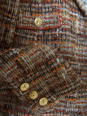
note the gilt buttons with double CC Chanel buttons, and the skillful way the material has been manipulated to make an excellent edging

In three decades of experience of working with and studying vintage clothing, I’ve seen a lot. The spectrum ranges from pristine Paris couture to decades old Levi’s denim, to rare and valuable leather motorcycle gang or WWII aviator jackets with cartoon like leather appliqued motifs. For the most part, the search, be it at prestige auctions, estate sales, antique shows, Salvation Army outlets, or in curbside garbage, is like finding a needle in a haystack. In spite of limited success and discovery I consider it a pleasurable treasure hunt for grownups.

When one is confronted with heaps, stalls, and racks of vintage clothing, the eye learns to quickly scan for colour, quality, rarity and the unique. Go looking for a specific item and it will never show up, but the unexpected often does. In this search anything is possible…like the colourful leather Wonder Woman boots. Where did they come from, and how were they used? Were they part of a very elaborate Hallowe’en costume, or were they an ironic accent in a circa 1970 hippy outfit?

Of course one is excited to find vintage Chanel, Hermes and Vuitton, but after looking at thousands and thousands of items, I’ve come to conclusion that there are plenty of other brands, or even anonymous pieces, that are as good as the most prestigious brands. For example, the leather goods of the American firm Ghurka or even pre-Chinese manufactured Coach sometimes surpass Hermes in quality, design, and durability, and are 1/10th the price. Some “Vuitton” items are lined with leather rather than fabric, and are better made than the originals.

One of the interesting vintage products that I see from time to time, are the fine clothes of Montreal designer Auckie Sanft. I am not sure exactly what years they were in production, but stylistically, the pieces I’ve encountered would date from 1960 to 1975. Their signature look was an interpretation of the classic Chanel tweed suit, and they did some very carefully selected copies of iconic French designer dresses, such as Yves Saint-Laurent pop art dresses from the period. But it is these Canadian “Chanel” suits and jackets that are remarkable. They are beautifully made and styled. They have gilt buttons with the famous Chanel interlocking double C logo. The tweeds are superb Linton (linings have the Linton tweed label), identical to those Coco Chanel herself selected. These tweeds are light, soft, and show an adept use of colour and texture; they are as visually satisfying as artisanal tapestry.
this late 1960s Auckie Sanft Linton tweed suit has an orange lining, and russet and tangerine yarns in the fabric

note the wear around the buttonhole, through the lining to the canvas inner construction; the tweed exterior is entirely unworn and looks like new

Auckie Sanft pieces were sold at the Simpson’s St. Regis Room (ironically they sold original Chanel later in the 1980s and early 1990s), Eaton’s, Holt Renfrew, Creed’s, and the WASP-y Ada Mackenzie shop in trendy Yorkville.

How does an Auckie Sanft suit differ from a vintage Chanel original? The linings were not silk, the jacket hems are not weighted with gilt chains, and they didn’t come with matching blouses. An original Chanel jacket usually uses 3 varying sizes of buttons; on a Sanft jacket the buttons are all of one size. They also lack the triangle inset of material under the arm where the sleeve is affixed to the body of the jacket (this gave ease of movement). Other than this they look, and can absolutely pass for Chanel. I’ve found Sanft Linton tweed jackets in which the linings are worn to shreds, but the tweed itself shows no wear whatsoever. Like Harris tweed and other fine fabrics, it is incredibly durable.

If ever you come across an Auckie Sanft “Chanel,” grab it. It looks as good as a new $10,000. Chanel jacket and it will be under $150.00, sometimes much less.

I’m not sure if there was a sort of licensing agreement with Chanel or use of a toile or pattern when Auckie Sanft produced their pieces and put gilt CC buttons, but whatever their arrangements were, if any, they are an excellent example of how a coveted example of Paris couture fashion was translated for the North American, specifically Canadian market. For this reason, I’m sure there are examples of Sanft “Chanels” in the textile and fashion collections of Canadian museums.

the Canadian made garment with union tag is now as rare as a horse and buggy; even some of the most prestigious manufacturers, such as Brooks Brothers and Coach, are now manufacturing in China

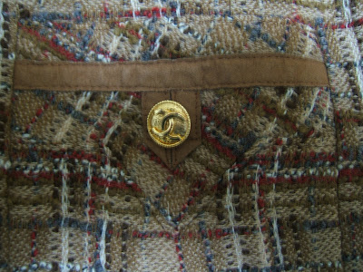
fine suede detailing on a pocket
this mid 1970s Auckie Sanft Chanel suit is noticeably more subdued in colour than the preceding earlier example; it was retailed at Eaton's of Canada, and the original price was $350.00; today's price would be about 10 times that, still a third of the price of an original Chanel

Thursday, February 3, 2011

A Balenciaga Masterpiece in Toronto

1960s magazine ad for Balenciaga perfume

I recently had the opportunity to examine a superb vintage Balenciaga day coat at the flagship of Toronto’s Holt Renfrew. Canada’s most prestigious clothing retailer, Holt Renfrew, was founded in 1837 in Quebec, and has held royal warrants, such as furrier to Queen Victoria. In the late 20th century, as furs were seen less frequently, and were viewed as politically problematic, the store became better known for supplying designer and other fine clothing and accessories for men and women. Among the brands carried are Christian Dior (a relationship starting in the late 1940s when Dior himself visited the store and Toronto social scene), Chanel, Gucci, Saint-Laurent, Moschino, Oscar de la Renta, Dolce & Gabbana, Ralph Lauren, Louis Vuitton, and Roger Vivier. In keeping with the times, and the popularity of vintage clothing, they have offered a diminutive, exclusive collection of pieces by vintage dealer Linda Latner of Vintage Couture. The collection consists of a single rack, but is of such quality and so carefully selected, or curated, that it is always a pleasure to view. This is the closest one can physically get to museum quality vintage couture.

Some months ago, I was particularly intrigued by this superb, mid 1960s Balenciaga couture coat offered at Holt's. Interestingly, it had been first retailed by Holt Renfrew, the same store selling it now, some 45 years ago. Apart from this fascinating historic detail, the coat in itself is an exemplary piece of Balenciaga, the type that connoisseurs and curators of fashion admire. Typically, in the 40s, 50s, and 60s, a few select pieces of couture were brought in, and promoted by top retailers such as Bergdorf's, Saks, and Neiman-Marcus in the United States, Harrods in London, and Eaton's, Simpson's, Creed's, and Holt Renfrew in Canada. They were often featured in illustrated, full page newspaper ads, and would create an exclusive buzz while demonstrating a trend, colour, or theme for the season that was available in the store's less expensive lines. Sometimes, a couture example was reproduced as ready-to-wear, at a much lower price, but with a certain cachet of having the design reproduced or adapted from an exclusive Paris model.

In the mid 1960s, Balenciaga clothes reached an amazing level of skill and design evolution. The clothes were simple and wearable, but very original. Balenciaga believed in simplicity as a form of dignity. Many consider the clothes almost monastic in feeling, reminiscent of liturgical robes, ecclesiastical garments, and religious habits. Balenciaga was partial to heavy, costly fabrics that had body and structure. His designs were simply cut so as to show the quality and beauty of the fabric.

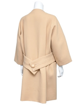
For aficionados who appreciate cut and couture, this day coat deserves closer examination. It is boxy and cut away from the body. It is pieced in large horizontal panels, giving a slightly segmented feeling, especially when it is worn. It has an ease and generous feel that was the antitheses of the corseted, cantilevered, padded and shaped 1950s Christian Dior ideal a decade earlier. The narrowest horizontal panel, about 4” wide, is at waist level (the bottom edge is also the opening to the left and right slash pockets), and becomes a loose, drape-y half belt at the back that holds in the fabric folds in soft box pleats. In a medium weight wool with an almost felt like surface, and in a quiet cream, this is luxurious Paris couture in the most discreet manner. Considering the great expense of Paris couture, a coat like this which sits away from the body, and would actually fit a range of sizes and weight fluctuations, might be considered a better investment than a fitted, limited use, gala gown.

In considering such a design, one should imagine it in different fabrics and colours, just as Wallis Simpson did with her favorite couture models. She is known to have pleasantly surprised Dior himself by reordering one of his own models in an entirely different colour and material. This would be a bewitching evening coat in black or raspberry heavy matte satin. It could be a beautiful spring coat in hot pink mohair. A Donegal or Linton tweed example would be wonderful in fall. Black wool serge or gaberdine would make it the ultimate all purpose coat.

Looking at a really fine couture example such as this, it is understandable that the elite of the 1950s and 1960s, women like Mona Bismarck and Bunny Mellon, ordered several versions for various residences, and in different colours for variety. One is struck by the balance, proportion, and taste of such a design, and yet it has a retiring aspect. Balenciaga clothes are as much about the wearer as they are about the garment, and they have a sense of modesty that is ennobling.

One cannot help but wonder why a stylist or design studio didn't acquire this piece. Top design houses are known to take vintage pieces as "inspiration." It certainly wouldn't have been out of place in a well edited Prada, Jil Sander, or Marc Jacobs collection. With a price similar to a new Chanel jacket, I don't think that such a rare and exceptional piece is unreasonable, but then stylists of the world don't usually think of Toronto as a destination for superb vintage couture.

I agree with fashion historians who have assessed Balenciaga as the greatest couturier, and I’ve seen many incredible pieces in museums, private collections, and books, but this has to be one of my favourites. Because it is such a superb example, and is a document of the way Paris couture was disseminated to far away, sparsely populated Canada, I would loved to have seen it go to the fashion collection of the ROM, Seneca College, or the Musée des beaux-arts de Montréal. But least I have photos and got to hold it in my hands, and in a way, that was better than viewing it behind glass and in obligatory archival low light conditions.

Many thanks to Lynda Latner for generously sharing the images, and for sleuthing out such a masterpiece.

http://www.vintagecouture.com/

Images courtesy of Lynda Latner of Vintage Couture

mid 1960s cream wool Balenciaga coat


detail of back of Balenciaga coat; note the elegant yet casual draping and the way the back panel is one with the sleeves (cut Raglan style at the front)

these wonderful large buttons, so simple and beautifully proportioned for the coat design, remind me of French macarons from Ladurée

the labels of Balenciaga and Holt Renfrew that connect the old and new world with couture