Showing posts with label Sonja Bata. Show all posts

Wednesday, May 9, 2012

Roger Vivier Exhibition at the Bata Shoe Museum, Toronto


the charming Sonja Bata wore a beautiful light coral suit and the discrete Order of Canada decoration on the night of the exhibition opening

May 8th, 2012, was the opening of the Roger Vivier exhibition at the Bata Shoe Museum in Toronto. Vivier was called the “Fabergé of Shoes” and he worked with Christian Dior, who allowed Vivier’s name on the label along with his own, the only co-creator that was permitted this honour. Both were great connoisseurs of the arts, with a deep respect for the arts and crafts of 18th century France. In fact, many of the clothes of Dior and shoes of Vivier were modern designs with influences, construction, or proportions of the 18th century. Dior’s label incorporated a Louis XVI style frame, Vivier’s had his name written in 18th century style copperplate script. Either designer could be over the top with embellishment and luxury, but both could work equally well in the most crisp, minimalist aesthetic. It was a creative partnership made in heaven.

Roger Vivier's salon, circa 1990; note the 18th century room rendered modern and less formal with terra cotta tile floor, absence of curtains, and a lack of moldings; it retains a whisper of the 18th century with the aristocratic room proportions, mullioned windows, a few choice antiques, and a very balanced arrangement of furniture, from Roger Vivier by Pierre Provoyeur, Éditions du Regard, 1991


a pair Louis XV chinoiserie red lacquer cabinets lend balance on the sofa wall; opposite the low table is a pair of black leather Mies designed Barcelona chairs, from Roger Vivier by Pierre Provoyeur, Éditions du Regard, 1991

Roger Vivier had admirable taste in realms other than the design of shoes. His home was a very modern mix of 18th century antiques and 20th century classics. It looked right because he maintained a disciplined palette of cream with black and red lacquer accents, and arrangements were often very balanced and symmetrical. The 18th century was important, but was not presented as a period room reconstruction. And for someone who designed the world’s most extravagant and often possibly conceptual (before this category of art had been thought of) shoes, in any photos I’ve seen of his own feet, they appear to be shod in quite broken in American penny loafers. Like his next creative collaborator, Yves Saint-Laurent, he understood the enduring appeal of classics high and low, and there was no need to reinvent, only to see things in a slightly different colour, proportion, or material.

The opening night reception of this exhibition was very elegant and enjoyable. The fashionistas were in full force. Socialites Catherine Nugent, Westons, and devoted fashion animal Suzanne Rogers were present. Grande dame Sonja Bata spoke with great charm at the introduction and related the designs of Dior and Vivier to the late 1940s when she was a young bride (she was married in 1946, the year before Dior’s revolutionary “New Look”), and how joyful and fresh they appeared in contrast to the broad shouldered utility wear of the war years. She also mentioned that, “The shoes weren’t that comfortable,” which brought unanimous laughter from the audience. French consulate representatives, prominent journalists Jeanne Beker, Bernadette Morra, and David Livingstone also attended. Museum curator Elizabeth Semmelhack spoke of the genius of Roger Vivier and was on hand to answer questions and sign copies of her excellent book on the designer. Guests listened to a French style chanteuse with piano accompaniment and Moët & Chandon flowed very freely.

The party was so much fun that it was difficult to tear one’s self away to view the spectacular shoes. I did look at them with great interest, but will have to revisit to contemplate their amazing design without the party crowd. This is not a show just for admirers of fashion, because these shoes, especially some of the more fantastic, are great works of art in themselves, as much to be admired as objets, as to be worn. An interesting anecdote was told regarding some of the fantastic, embroidered and beaded masterpieces. A woman returned with one that lost some of the applied jewels and Vivier’s manager, Michel Brodsky responded, “But Madam, you wore them!”

This shoe will be running for the next eleven months, and is most highly recommended, as is a visit to the Bata Shoe Museum at any time. The Bata Museum is most conveniently located, steps from the St. George subway station and University of Toronto campus.

Portrait of Roger Vivier, 1990, from Roger Vivier by Pierre Provoyeur, Éditions du Regard, 1991
Roger Vivier paper collage, 1991, Bata Museum
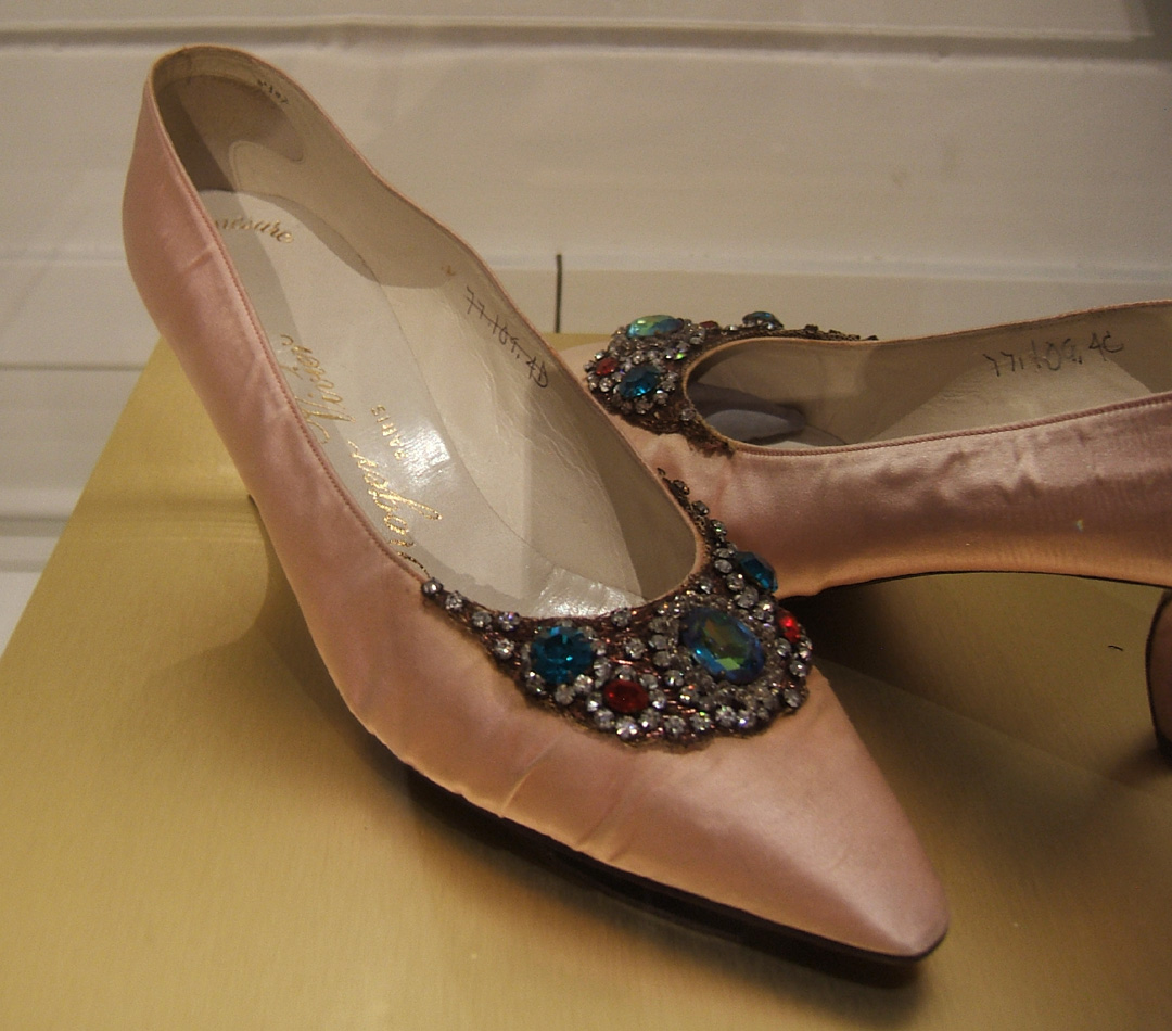
bottine in style of Madame de Pompadour, blue silk satin, ribbon, lace, and sequins, 1961, Metropolitan Museum of Art
a showstopper in the exhibition was this pink satin sandal; it deserves to be put into production; with embroidered butterfly ornament, a 1953 sample, collection of the Bata Museum
early 1960s stilletto pump, covered entirely with iridescent feathers...a conservator's (and conservationist's) nightmare
these 1964 gold velour mules feature a very elongated tongue; because it was so visually dramatic, Vivier was frequently photographed with it; collection of Maison Vivier
a unique pump of pink fur (not sure if it is mohair or Orlon) with paste jewel and a unique Vivier heel, 1962-1963, Metropolitan Museum of Art
pink silk satin with paste jewel ornamentation, early 1960s
silk satin with silver embroidery and pearl pendant drops, 1959, Metropolitan Museum of Art
gold frame from the museum exhibition, done as a silhouette of a Louis XVI Dior salon frame with a bow at the top
detail of Roger Vivier's own penny loafers and Argyle socks, from the above portrait
the author's own loafers which he wore to this exhibition opening; I'll consider it my 'umble hommage to the master
gold satin pumps with gathered detail at the instep; these were bespoke, using same material as the dress they were worn with, for Princess Lilian of Belgium, circa 1953-1955
a departure from the 1950s are these mid 1965 pyschedelic print Pilgrim pumps with matching handbag
vivid printed silk pumps with one of Vivier's unconventional and very original polchinelle heels which lend the wearer a stylishly exotic air, 1961
silver leather high top sandal, with African mask-like ornament, likely contemporary with Yves Saint Laurent's tribal collection of 1966; I am reminded of the tin man in The Wizard of Oz
these exceptional pumps had a faintly Persian and 18th century look; certainly these are worthy of display in a vitrine; Marie-Hélène de Rothschild sometimes wore such dramatic shoes to her fantastic parties of the 1960s and 1970s; the donor of these shoes, society event and interior designer Valerian Rybar, was a good friend and collaborator with the famed Rothschild matriarch; 1962, collection of the Metropolitan Museum of Art
the conventional black pump is updated and becomes unexpected, and slightly perverse with sides of transparent vinyl; peek-a-boo was a style statement in the mood of being anti-establishment in the 1960s

this magazine advertisement represents a collaboration of three creative geniuses of design; shoe design by Roger Vivier to accompany the fashions of Christian Dior, depicted in this illustration by René Gruau, in which a delicately shod foot steps on a rose, all within the Louis XVI frame favoured in the couture salon and boutiques of Christian Dior

Vivier mule with an Indo-Persian feeling, embroidered with pearls and embellished with a wired, tiara-like ornament on the instep, 1959, Metropolitan Museum of Art

 unless credit is specified, photos by Square With Flair

Monday, August 9, 2010

Annigoni Paints Sonja Bata, and Vice Versa, part II

Sonja Bata in her study showing her Annigoni portrait over the fireplace in her study, City and Country Home Magazine, May 1989 Portrait of Sonja Bata, Pietro Annigoni, oil on board, 1963 , image courtesy of Sonja Bata

As I interviewed Mrs. Bata, our discussion drifted from the fascinating portrait to Annigoni's work in general, architecture, and the Bata Museum, which celebrated it's 15th anniversary this year. Her knowledge in many fields is comprehensive, and her opinions demonstrate wisdom, intelligence, and experience.

S.w.F.- I write about and discuss fashion in my blog. The red coat you wear in the portrait is beautiful. Who were some of the designers you wore during the period?

S.B.-I did at that time buy quite a few designers and I went to Paris quite frequently. It wasn’t Chanel, but one of those designers.

S.w.F.- I wondered if it could be Balenciaga.

S.B.- I had a beautiful piece by Balenciaga, but the red coat in the painting was not Balenciaga.

S.w.F.- The simple red coat you wore is an excellent choice for this portrait. It is so pure and rigorous that it defies obvious associations. It does not speak of status, era, function, or current fashion, and therefore does not distract the viewer from the image of the subject. The rich red attracts, but it is muted, almost antique, so that it doesn't overwhelm. It is a monastically simple coat, like many of the severe and simple garments of Balenciaga, Givenchy, Hardie Amies, or Oleg Cassini. It is perfect as it is so appropriate and compatible with the style of portrait, yet is a pure, architectural garment such as was fashionable in the early 1960s and is just as elegant today. I’m wondering if you can tell us anything about it or the designer.

S.B.-I cannot remember who the designer was, but it was one of the top designers. I remember I didn’t know what to wear to have my portrait painted, so I wore a very simple dress and I wore that coat over it, and when I arrived there he said, “Don’t take the coat off. I’m going to paint you the way you are.” I think he liked colour. So there was never any question about it. So he painted me in the coat and gloves, the way I wore them to the door. The starkness of it, again, as I mentioned...we had two slightly different approaches to Art. He was totally immersed in the Renaissance and everything that happened in the late 19th century and the 20th century was strange to him. He couldn’t comprehend it. Among modern painters there are classical modern painters. He tried to convince me of the Renaissance and what was involved in the Renaissance, and so we had these discussions. They went on for years, and after the portrait was finished we visited in Florence, and then he came to Canada, so we still saw each other from time to time.

Self Portrait by Pietro Annigoni, 1946

S.w.F.- Do you recall, approximately, the year Annigoni came to Canada?

S.B.-I would have to look it up. He painted my portrait in ’63, then it must have been ’67, '68, or '69? It was several years later that he came. He was an extraordinary man. He also knew how to live. He had so many girlfriends that it was outrageous. He loved women and he loved to drink, but in a nice way, you know, in a very nice way. Somehow he spoke about it rather frankly, and he was quite funny.

S.w.F.- It is well known that he was a womanizer and hard living. Did you see any evidence of a wild or reckless side to his nature or character?

S.B.- Oh, there was quite a bit going on in London. And one thing, he had a girlfriend that he was extremely fond of, and she posed for him as a Madonna which he painted for one of the British churches, and she really was not a Madonna! I remember he took me to show me this finished painting and I just couldn’t get over it. "You know who she is. She is a very beautiful woman, but here she is a Madonna!" It was very strange, she shouldn’t be painted like that (lots of laughter). We had fun; we laughed about it.

S.w.F.- Do you think Annigoni felt compelled to idealize women in his art in a way that he did not in portraits of men, as in the portrait of JFK, with a droopy eye, and in images of some male saints?

Portrait of John F. Kennedy, Time Magazine cover January 5, 1962

S.B.- The drawing of Bernard Berenson is a very good one. I have wonderful drawings he did of elderly men which were stunning. I think he was attracted by women, he enjoyed working with women and he brought out the best in them. He wasn’t interested in painting children.

S.w.F.- I understand that Annigoni bicycled to his studio each day. Does this appeal to your interests in ecology, sustainability, urban issues, or perhaps a certain admiration for a European lifestyle that is less dependent on the car?

S.B.- Well, I don’t know enough about it. I remember in Florence he walked to his studio. You know these are very old, narrow streets, cobblestone, and I don’t believe bicycles were there, so I think he walked quite a bit. He enjoyed walking. He loved to be in the countryside. He liked to be outside.

S.w.F.-I have a question about the room situation and the frame that the portrait is in. In the photo in City and Country Home Magazine, it is over a neoclassical mantelpiece, and it seems to be more of a traditional room. Is that the way it is now?

S.B.- Yes it is. It is in a study which is paneled with wood, and it hangs over a fireplace.

S.w.F.-So you would say it’s in more of a traditional setting.

S.B.- Yes it is.

S.w.F.- I am curious about the frame which sets the work off so beautifully. The frame seems to be a substantial, plain gilt molding, which is classic and traditional, but as simple as possible. It is classic enough to be 18th century, Renaissance, European, or English.

S.B.- Annigoni picked the frame in Florence. It came with the frame. I could have no influence on the frame whatsoever!

S.w.F.- Well, I think it’s perfect. It’s absolutely perfect.

S.B.- He chose the right frame, and that was it.

S.w.F.- Has the painting required anything in terms of conservation?

S.B- No, I think I really should get it cleaned because the fireplace underneath is used from time to time and so probably it should just be cleaned with distilled water, no special cleaning.

S.w.F.- If an important museum such as the National Portrait Gallery had an Annigoni retrospective, would you consider loaning your painting, if it was requested?

S.B.- I think if it is an important museum, yes. Yes because I think the painting is one of his better works. It’s funny. The things he liked himself are not necessarily the most popular ones.

S.w.F.- You’ve already touched on this, but what is your opinion of the Princess Margaret portrait.

S.B.- No!

Portrait of Princess Margaret, oil on canvas, early 1960s; note the highly Renaissance style and details, and religious feeling with an illuminated cloud behind the head suggesting an aura or halo

S.w.F.- I wonder if she found it embarrassing.

S.B.- I don’t know but he did a portrait of the Queen later on when she got some doctorate or something, she has one of those funny hats on.

S.w.F.- I suppose you would have been uncomfortable if he would have painted you in such a sweet, kind of sentimental way.

S.B.- Ah, I don’t think he wanted to, and I would have walked away...(laughter).

S.w.F.- Have you ever considered having the image on a postcard for the Bata Museum shop?

S.B.- No. No, because it’s rather private. It’s funny, but very few people know about the portrait, few people come to my house, so not too many people know about it.

S.w.F.- I read of a firm David Bird, whose English firm, Family Copies, specializes in copies of fine, valuable paintings, and that many Annigoni portraits hanging in homes are reproductions while the originals are in vaults. Have you considered having a copy made for the museum, or for other family members to enjoy, or for safety?

S.B.- I know where another image of the face is. About 3 or 4 years after he painted me, he got a commission by a family in New York, Stillman is their name, for huge painted wall frescoes, and I am one of the figures in this work. He introduced me to the family because he told them he was using my head. It’s one of 6 or 7 figures in a landscape. The family, as a hobby, was involved with horses and they came to a horse show in Toronto, and we met at that time.

(Note to reader: Chauncey Stillman was an American philanthropist, connoisseur, and architect. Annigoni spent a year painting frescoes in the ballroom of his neo Georgian residence, the 1,200-acre estate, Wethersfield)

S.w.F.- You talked a bit about the womanizing aspect Annigoni, but he also did so much religious work. Did you sense anything spiritual or religious in his character or behaviour?

The Glory of St. Benedict, 1980-1985, Abbey of Montecassino, Italy, fresco; this genrous work is 40 m²

S.B.- Ah, that’s a funny question because he enjoyed working in churches and he enjoyed painting saints. You had a feeling that in painting saints that he felt he was painting somebody really special. He certainly wasn’t a church going individual as far as I know. He had a tremendous respect for things which were religious.

S.w.F.- You said that you discussed your great interest in architecture with Annigoni. I believe you love modern architecture and innovation, such as the Moriyama design for the Bata Shoe Museum and the architecture of your home in Batawa. I would imagine that if Annigoni loved classical portraiture, he also admired classical architecture derived from the Renaissance and from and antiquity. Do you think that you shared common ground with regard to architecture?

S.B.- Well I think the ground we shared was that architecture is good if it’s not trendy, with other words, if it is good it stays good. I believe with modern architecture as with the work Moriyama did for me, the Bata Museum was opened in ’95, and I still think the proportions are right, it fits in the street scape. So as long as it fits into the environment, it becomes part of the environment. Modern architecture can be very beautiful.

S.w.F.- He agreed with you on that?

S.B.-We agreed.

S.w.F.- It is exactly 15 years that the Bata Museum has been opened. Have you been satisfied with the endeavor?

S.B.- I’m very happy about the building. Moriyama was given an award for the building, and he said it is his favourite museum and his favourite building.

The Bata Shoe Museum at Bloor and St. George St. in downtown Toronto, designed by Raymond Moriyama, opened in 1995

S.w.F.- You grew up and were educated in Europe, specifically Switzerland, with a central location that gives one excellent exposure to the art, history, and design of northern and southern Europe. How important is it to spend one's formative years surrounded by great and important art, architecture, and design?

S.B.- You know, as I get older, I find it is terribly important. Because even on my way to school I passed all these ancient cathedrals. You see good architecture, so you are educated with that, and you learn how to look at things.

S.w.F.- And you just subconsciously absorb the proportions, right?

S.B.- Yes you do, and you see other things, and it reminds you of what you remember. So I think it means a great deal to be surrounded by these things.

S.w.F.- In that sense do you think that this is possible in America in the way it is in Europe?

S.B.- Well, I think we have to improve our man made environment a little bit. We do so many things just to shock or be different, and it is horrible.

S.w.F.- How do you feel about the new Royal Ontario Museum Crystal?

(note to reader: The Crystal is an irregular, aluminum and glass, deconstructivist addition designed by Daniel Libeskind. The multi story, 175,000 square-foot structure was completed in 2007, and is integrated with the original 1930s neo-Byzantine stone structure.)

S.B.- Well you know, it is interesting, I think that they wanted to do something special for Toronto, and they wanted an architect to design some sort of a monument like Bilbao, but they never spoke to the curators about it. Having the input of the people, it is very important that the people who work there have some input. He devised an extraordinary design, but it doesn’t work out.

S.w.F.- Do you feel your affinity for modernism in architecture is related to leaving the sadness and destruction of the war in Europe, and the desire for things that were fresh, new, clean, and optimistic?

S.B.- I like minimal and clean things, and functional things, and I like things which are not decorated just for decoration’s sake. So even the decoration comes automatically by having a very beautiful line. So it’s just my taste. I’m not a fan of the Victorian period.

S.w.F.- Thank you so much for taking the time to discuss your portrait, Annigoni, and your aesthetics. I have been fascinated and delighted.

S.B.-You observed the portrait very closely and you did a study on it. That’s very intriguing.

S.w.F.- Ever since I’ve seen it, it was in my subconscious. For two decades, it absolutely was, and it still is. Thank you so much.

Interview has been edited and condensed.


Monday, August 2, 2010

Pietro Annigoni Paints Sonja Bata, and Vice Versa, Part I

Pietro Annigoni, portrait of Sonja Bata, oil on board, 1963

This year is the centenary of the painter Pietro Annigoni's birth (June 7, 1910-October 28, 1988). Annigoni is important for his distinctive style which was representational, realistic, and often in the tradition of the Italian Renaissance. His work contrasted with the modernist and post-modernist styles of the second half of the 20th century.

In May of this year I was honoured to interview Sonja Bata regarding her portrait, painted by Pietro Annigoni in 1963. Since the late 1940s, Sonja Bata has been directly involved in the Bata shoe business throughout the world. She has worked in many philanthropic, cultural, environmental, and educational activities and causes. Mrs. Bata has received numerous honours and awards throughout her distinguished life.

Mrs. Bata describes the highly specialized techniques of Annigoni, the character of this complex man, and the exquisite jewel of a painting that is the enduring legacy of a fascinating meeting of two highly cultured, dynamic people. I am not aware of any previous interviews with Mrs. Bata regarding this portrait, and she was very enthusiastic and willing to share her thoughts and memories of the commission and the process of how the portrait developed. As she spoke of the portrait, her animated words sparkled with joy. Her compelling description of her dear and esteemed friend, Pietro Annigoni, is a portrait of him painted in words and memories.

Mrs. Bata graciously answered many questions and supplied interesting anecdotes along the way. This interview has been divided into two parts.

S.B.- I am intrigued that you are investigating the portrait.

S.w.F.- It is a sort of personal subject, so I hope it isn’t uncomfortable to talk about something as private as a portrait. I first saw the portrait in the May 1989 issue of City and Country Home. I don’t know if you recall that feature.

Sonja Bata in her study showing her Annigoni portrait over the fireplace, City and Country Home Magazine, 1989

S.B.- I remember that it was in some magazine. It’s a good portrait, and I very much like it, not because it’s me.

S.w.F.- What drew you to commission the portrait from Annigoni?

S.B.- Oh, it was really my husband who wanted to have the painting done. I was extremely hesitant. Annigoni had painted some friends of mine, and did a really superb job, and earlier than that he painted a portrait of the Queen which is very famous. It was on postage stamps and it’s all over the place. For me it is a little bit too sweet, and in fact he didn’t like it himself. He said, "It looks like the cover of a chocolate box.” So it’s not one of his favourite ones, and I shared his opinion. But this is really how I met him, and we met socially in London, and then it was my husband who asked him if he would be interested. He was interested, and then he started painting me in London. He had a studio in England, and Pietro was a really fantastic individual in the way he behaved, and a very interesting individual to talk to, very into Art, highly educated, and then after he painted me, for many years we corresponded. He wrote to me in French, although he spoke English fluently, but he preferred French.

So he started the painting in London, with layers and layers of lacquer and paint, lacquer and paint. It takes a long time to build up and it’s really a fantastic way of painting, and then one day he said, "I really would prefer that it would be a larger portrait." I wore a red coat, and that time he was going to leave. So he said, " Take off your coat and gloves, and I can get someone to stand in for you and I will finish your portrait in Italy." Many of his portraits at that time have an almost Tuscan background. And I told him, “You know the Tuscan background? That’s not for me." I told him that as a young girl I wanted to be an architect, I studied Architecture, and I also like some modern art, not the school of modern art, but I do like some of the modern art. And Annigoni and I, we always had a tremendous argument about it, and he thought a lot of it was junk.
Sometimes I took him to the Tate Gallery and he took me to other museums and we would discuss what Art was all about. But you know that in front of my portrait there is a plain straightforward railing, which is a little bit of a hint of what he thought about my modern art (aesthetic). You see that there is a very plain iron railing in the foreground of the painting. This is a suggestion of my interest in Architecture and the simplicity and minimalism I like.

Pietro Annigoni, detail from the Portrait of Queen Elizabeth II, oil on canvas, 1955

detail of the dreamy, Tuscan landscape from the Annigoni portrait of Queen Elizabeth II

S.w.F.- When you were growing up in Zürich with your parents’ fine art collection, did this prepare you or give you an appreciation for this type of art?

S.B.-Very much so. My mother was on the board of the local Art Gallery in Zürich, and had quite a collection of Impressionist paintings, so we had beautiful art at home and a really valuable art collection, so I was surround by Art, and loved Art very much.

S.w.F.- Bernard Berenson (1865 – October 6, 1959, American Art historian and expert on the Renaissance) said, "Annigoni will remain in the history of art as the dissenter in a dark age for painting." It seems you disagree with this?

S.B.- It is funny you should mention that. He always showed that drawing which he did of Berenson, and he kept on repeating what Berenson had told him, that he was such a talented artist. I would say that Berenson’s remark carried Annigoni through some very difficult periods. This man really saw in his drawings this capability. It is funny that you mention that. To him it was probably the most important remark that anybody made at any time, and it influenced him greatly.

S.w.F.- What were your initial impressions of the portrait and how did friends and family receive it?

S.B.-I think they received it well. People liked the portrait. It also has that wonderful magic of a Renaissance portrait that the eyes follow you wherever you are in the room. It doesn’t matter where, the eyes look at you. It is magic. It is a Renaissance technique that he incorporated in my portrait.

S.w.F.- What was your husband’s reaction?

S.B.- He liked it, he liked it very much. And Annigoni came to Toronto, and when he was here he painted a portrait of my husband. Frankly, I don’t like it very much, his eyes are very good, but there is something wrong with the nose. He asked Annigoni to have a studio next to his office and he would come in from 3:30 to 3:45, and he would keep on looking at his watch and somehow with Annigoni this didn’t work. He was not the type of man you could say, “Now paint. Now stop painting.”

S.w.F.- Do you feel any differently about your portrait 45 years later?

S.B.- You know it’s funny. I never look at it as my portrait. I look at it as a very beautifully painted portrait. So I feel a detachment and looking at the portrait I realize how he achieved the colour of the face and the transparency of the paints. I saw him do it, and I saw the tremendous amount of work that you need and that is necessary with these layers and layers of paint and lacquer on top of each other. He mixed his own paints and he had his wine, and he put a little wine in from time to time! It was very interesting.

We had some very interesting discussions about the restorations (of important Renaissance paintings) and at that time and Annigoni felt that they had ruined them. These paintings had also been painted with the technique of alternating layers of lacquer and paint, and lacquer and paint. They removed the top lacquer that is very soft to start with, and they don’t know where to stop. He tried to explain to me in detail, all the wrongs that were being done, and he was terribly upset about it.

S.w.F.- At the time had you considered other contemporary painters, you were in London, such as Graham Sutherland, or perhaps Dali or Picasso?

S.B.- No. I never would have wanted Picasso. I think that Dali did some fantastic paintings, but not as a portrait.

S.w.F.- How do you feel about portraits by artists such as Bacon, Freud, or when they exaggerate or distort the features?

S.B.- No, I couldn’t live with it. But I think Picasso is in another class because the work is great but you don’t look at it really as a portrait. Portrait painting is a really special art. You can be influenced by an African mask, or influenced by anything, but I believe that to paint a portrait is difficult; there are very few people who can do that.

S.w.F.- I read that in the late 1950s Annigoni had to turn down hundreds of portrait commissions. Was it difficult to have him accept the commission due to his having prior commitments, commissions, or projects? It sounds like he accepted it quite soon after your husband asked.

S.B.- He did. I think he accepted if he liked the face, and if the face was a challenge, and it had nothing to do with being beautiful or not. The face had to intrigue him in some way. You know it could be an old man or anything, but somehow he had to be able to relate.

S.w.F.- I read that in the 1950s his portraits were about $5,000.00, likely the equivalent of $50,000 today. Did it feel extravagant, or did you think of it more as your being patron of a piece of very fine art or something that was a significant cultural exercise, and for posterity?

S.B.- At that time the fee was expensive but not outrageous because of the work which is put in. Oh, it took so many sittings. There was a tremendous amount of work. He had become famous because of the portrait of the Queen which he himself didn’t care for, but this is what put him on the map. Actually, of Annigoni’s work, I have some of his sketchbooks. He sketched people left and right and he would throw these sketchbooks away afterwards in an offhanded way, keeping one or two sketches. I’ve bound them in leather because there are so many brilliant ideas in there and it is in his sketchbooks that he shows his immense talent as a draftsman. It is incredible.

I also think that some of the sketches look a little bit more modern. He did some things…at that time I was in London and I was involved in the opera as a volunteer, and I needed something for an opera program, so he said, “Fine, I’ll sketch you an opera program." In no time at all, he sketched me an opera loggia with people; he said it was more of a caricature, but it was very modern and very funny. So if he wanted to he could be modern.

To be continued. Please check Square with Flair next week for the second part of this interview. Interview has been edited and condensed.

Thursday, May 13, 2010

Happy 15th Birthday, Bata!


the beautiful Bata Museum insignia, deeply etched on the curved glass surround of the front revolving door

the museum's bold, classic logo in a style reminiscent of early 20th century graphics
Raymond Moriyama's award winning design for the Bata Shoe Museum in Toronto, Canada


Happy 15th Birthday, Bata!

This May, the Bata Shoe Museum of Toronto was officially 15 years old. It was 5 years in the planning, and after several difficulties and delays, it was opened on May 6, 1995.

The Bata is one of the most important shoe museums in the world, and it is a cultural treasure for Toronto. Some of their wonderful surplus has gone to other venerable and prestigious museums such as the Victoria and Albert.

The Bata is in a choice location on the southwest corner of Boor and St. George, surrounded by other buildings of interesting architecture such as the York Club, and the neoclassical style medical arts building across the street from it. Accessible by subway, it is near the ROM and the Gardiner Ceramics Museum, Yorkville, and it absorbs some of the atmosphere of academia where it is convenient for researchers from nearby University of Toronto.

the stately, richly detailed, late 19th century York Club, on the north east corner, opposite the Bata Museum

the Bata Museum seen from the manicured lawns of the historic York Club

Mrs. Bata’s attention to detail is evident in the superb custom bronze door handle medallions used on entrance and gallery doors, the reverse relief/ intaglio shoe carved in the stone facing beside the front entrance, the interesting prismatic glass appliqué on 42 foot high soaring the central hall window by Lutz Haufschild, and copper cladding on the jutting front entrance. These details go far to lend nobility, humanity, and elegance to the modern architecture and give the museum the aspect of a continental boutique museum. Mrs. Bata's European heritage has given her an acute awareness and appreciation for the craftsmanship of special artisans and ateliers.
the reverse-relief, carved. stylised shoe design and patinated bronze lettering beside the front entrance

a circa 1730 tin glaze blue delft decorative shoe from Holland painted with tulips detail of the hall window showing coloured glass appliques, reminds one of Matisse paper cut outs
shapes suggest pieces of cut out leather before a shoe is assembled
the applied, diagonally set flat prisms of the 42ft hall window softly screen out neighbouring buildings

detail of precision custom welding in the angled windows of the front entrance

the dramatically angled front entrance on the south side of Bloor Street

f ront entrance seen from the light flooded vestibule

front entrance facing west on Bloor Street

f ront vestibule area with detail of plate glass railings that contribute to a bright, spacious feeling

Recently, I enjoyed viewing a very interesting interview by George Stroumboulopoulos on CBC's "The Hour", December 3, 2008. He asked the charming Mrs. Bata about starting the museum and if her family considered it a bad idea. Mrs. Bata said that her son in particular considered a museum a big liability, and when she said she agreed, she laughed light-heartedly. The tone of her voice made it apparent that it was a labour of love that had brought her great personal satisfaction. In the interview, when asked about how the museum collection began she said,

“It started because when I got married I wanted to be an architect and then my husband really wanted me as a member of the team, and as I like design, I started working with collections, and merchandising. We were expanding into Africa and the far East and Latin America. I was very curious to find out what type of shoes do people really wear in these countries, what’s the traditional footwear like, and so it was really a market research collection. This is how it started. And then there were other reasons why I started being really involved in the subject of putting this collection together. I noticed that the indigenous footwear was disappearing very quickly, and partly it was our fault because we were making cheap sneakers, and later on, plastic sandals. Plastic sandals wear forever, so they replaced the traditional footwear in these countries, which in many ways, it’s very sad. It is not only in the craft of shoe making, but for example in pottery seen in Mexican markets, or textiles with beautiful vegetable dyes. So I felt it would be interesting to somehow put down the history of the shoe making trades of all the different cultures be that China or India, Japan or wherever it was, and form the museum. From the museum we fund field trips to various parts of the world. We have somebody now in Mongolia trying to get some of the ancient footwear or the traditionally made footwear.”

http://www.cbc.ca/video/#/Shows/The_Hour/Full_Episodes/Season_5/ID=1237058429

from Lapland, sealskin boots with colourful detailing
boldly colourful beaded plains Indian moccasins

Canadian Indian (Cree) moccasin boots with unique Moose hair tufting
late 20th century urban sophistication in the iconic horse bit Gucci loafers
extremely fine glass beading on Amerindian moccasins

I asked Mrs. Bata if any of her own personal shoes are in the collection. She said the only pair the museum has is the pair that she wore to the museum opening exactly 15 years ago this May. She laughed as she suggested that her feet were "big" and not really right for the museum!

On this 15th anniversary of the Bata Museum, we can be grateful that Mrs. Bata has done so much to make Toronto the cosmopolitan and interesting city it is in 2010. Many, many thanks Mrs. Bata!

detail of shard-like, flat, cut prisms applied to the front hall window recall the angular planes of the facade
detail from a 16th or 17th century spurred boot from the bronze door handle reliefs of the Bata Museum


All shoes from the Bata Shoe Museum collection, Toronto.