Wednesday, May 9, 2012

Roger Vivier Exhibition at the Bata Shoe Museum, Toronto


the charming Sonja Bata wore a beautiful light coral suit and the discrete Order of Canada decoration on the night of the exhibition opening

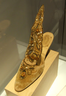
May 8th, 2012, was the opening of the Roger Vivier exhibition at the Bata Shoe Museum in Toronto. Vivier was called the “Fabergé of Shoes” and he worked with Christian Dior, who allowed Vivier’s name on the label along with his own, the only co-creator that was permitted this honour. Both were great connoisseurs of the arts, with a deep respect for the arts and crafts of 18th century France. In fact, many of the clothes of Dior and shoes of Vivier were modern designs with influences, construction, or proportions of the 18th century. Dior’s label incorporated a Louis XVI style frame, Vivier’s had his name written in 18th century style copperplate script. Either designer could be over the top with embellishment and luxury, but both could work equally well in the most crisp, minimalist aesthetic. It was a creative partnership made in heaven.

Roger Vivier's salon, circa 1990; note the 18th century room rendered modern and less formal with terra cotta tile floor, absence of curtains, and a lack of moldings; it retains a whisper of the 18th century with the aristocratic room proportions, mullioned windows, a few choice antiques, and a very balanced arrangement of furniture, from Roger Vivier by Pierre Provoyeur, Éditions du Regard, 1991


a pair Louis XV chinoiserie red lacquer cabinets lend balance on the sofa wall; opposite the low table is a pair of black leather Mies designed Barcelona chairs, from Roger Vivier by Pierre Provoyeur, Éditions du Regard, 1991

Roger Vivier had admirable taste in realms other than the design of shoes. His home was a very modern mix of 18th century antiques and 20th century classics. It looked right because he maintained a disciplined palette of cream with black and red lacquer accents, and arrangements were often very balanced and symmetrical. The 18th century was important, but was not presented as a period room reconstruction. And for someone who designed the world’s most extravagant and often possibly conceptual (before this category of art had been thought of) shoes, in any photos I’ve seen of his own feet, they appear to be shod in quite broken in American penny loafers. Like his next creative collaborator, Yves Saint-Laurent, he understood the enduring appeal of classics high and low, and there was no need to reinvent, only to see things in a slightly different colour, proportion, or material.

The opening night reception of this exhibition was very elegant and enjoyable. The fashionistas were in full force. Socialites Catherine Nugent, Westons, and devoted fashion animal Suzanne Rogers were present. Grande dame Sonja Bata spoke with great charm at the introduction and related the designs of Dior and Vivier to the late 1940s when she was a young bride (she was married in 1946, the year before Dior’s revolutionary “New Look”), and how joyful and fresh they appeared in contrast to the broad shouldered utility wear of the war years. She also mentioned that, “The shoes weren’t that comfortable,” which brought unanimous laughter from the audience. French consulate representatives, prominent journalists Jeanne Beker, Bernadette Morra, and David Livingstone also attended. Museum curator Elizabeth Semmelhack spoke of the genius of Roger Vivier and was on hand to answer questions and sign copies of her excellent book on the designer. Guests listened to a French style chanteuse with piano accompaniment and Moët & Chandon flowed very freely.

The party was so much fun that it was difficult to tear one’s self away to view the spectacular shoes. I did look at them with great interest, but will have to revisit to contemplate their amazing design without the party crowd. This is not a show just for admirers of fashion, because these shoes, especially some of the more fantastic, are great works of art in themselves, as much to be admired as objets, as to be worn. An interesting anecdote was told regarding some of the fantastic, embroidered and beaded masterpieces. A woman returned with one that lost some of the applied jewels and Vivier’s manager, Michel Brodsky responded, “But Madam, you wore them!”

This shoe will be running for the next eleven months, and is most highly recommended, as is a visit to the Bata Shoe Museum at any time. The Bata Museum is most conveniently located, steps from the St. George subway station and University of Toronto campus.

Portrait of Roger Vivier, 1990, from Roger Vivier by Pierre Provoyeur, Éditions du Regard, 1991
Roger Vivier paper collage, 1991, Bata Museum
bottine in style of Madame de Pompadour, blue silk satin, ribbon, lace, and sequins, 1961, Metropolitan Museum of Art
a showstopper in the exhibition was this pink satin sandal; it deserves to be put into production; with embroidered butterfly ornament, a 1953 sample, collection of the Bata Museum
early 1960s stilletto pump, covered entirely with iridescent feathers...a conservator's (and conservationist's) nightmare
these 1964 gold velour mules feature a very elongated tongue; because it was so visually dramatic, Vivier was frequently photographed with it; collection of Maison Vivier
a unique pump of pink fur (not sure if it is mohair or Orlon) with paste jewel and a unique Vivier heel, 1962-1963, Metropolitan Museum of Art
pink silk satin with paste jewel ornamentation, early 1960s
silk satin with silver embroidery and pearl pendant drops, 1959, Metropolitan Museum of Art
gold frame from the museum exhibition, done as a silhouette of a Louis XVI Dior salon frame with a bow at the top
detail of Roger Vivier's own penny loafers and Argyle socks, from the above portrait
the author's own loafers which he wore to this exhibition opening; I'll consider it my 'umble hommage to the master
gold satin pumps with gathered detail at the instep; these were bespoke, using same material as the dress they were worn with, for Princess Lilian of Belgium, circa 1953-1955
a departure from the 1950s are these mid 1965 pyschedelic print Pilgrim pumps with matching handbag
vivid printed silk pumps with one of Vivier's unconventional and very original polchinelle heels which lend the wearer a stylishly exotic air, 1961
silver leather high top sandal, with African mask-like ornament, likely contemporary with Yves Saint Laurent's tribal collection of 1966; I am reminded of the tin man in The Wizard of Oz
these exceptional pumps had a faintly Persian and 18th century look; certainly these are worthy of display in a vitrine; Marie-Hélène de Rothschild sometimes wore such dramatic shoes to her fantastic parties of the 1960s and 1970s; the donor of these shoes, society event and interior designer Valerian Rybar, was a good friend and collaborator with the famed Rothschild matriarch; 1962, collection of the Metropolitan Museum of Art
the conventional black pump is updated and becomes unexpected, and slightly perverse with sides of transparent vinyl; peek-a-boo was a style statement in the mood of being anti-establishment in the 1960s

this magazine advertisement represents a collaboration of three creative geniuses of design; shoe design by Roger Vivier to accompany the fashions of Christian Dior, depicted in this illustration by René Gruau, in which a delicately shod foot steps on a rose, all within the Louis XVI frame favoured in the couture salon and boutiques of Christian Dior

Vivier mule with an Indo-Persian feeling, embroidered with pearls and embellished with a wired, tiara-like ornament on the instep, 1959, Metropolitan Museum of Art

 unless credit is specified, photos by Square With Flair

Monday, May 7, 2012

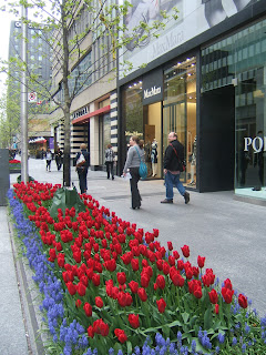
Toronto Tulips Along Bloor Street

An outdoor cafe next to Cartier has a definite Gallic charm.

These bright pink tulips contrast well with the monochromatic facade of Chanel.
I suspect many city dwellers are too busy to stop for a moment to enjoy these tulip beds.
Holt Renfrew is one of Canada's oldest, most prestigious purveyors of fine clothing.
Tulips and bicycles...I'm thinking of Holland.
Even Tiffany of Fifth Avenue lacks this generous display of spring beauty.

Stollery's is over 100 years old, and offers the most classic brands, like Pringle, Aquascutum, Viyella, Daks, and Burberry.
St. Thomas is a tiny street that connects Bloor to the university campus.  It is very chic with elegant apartment buildings and the venerable Windsor Arms Hotel.

I always find spring a busy time.  As Canadians emerge from hibernation, the garden calls to be tended, cottages are opened, and there is a sense of release as we shed our heavy layers of winter clothing.

This May, I almost forgot to venture to Bloor Street, Toronto's so called "Mink Mile," to view the breathtaking displays of spring bulbs.  Bloor Street has the finest stores, and is in walking distance to museums, restaurants, and the campus of the University of Toronto.  Luckily, we've had a long, cool spring, so the displays have lasted a good two weeks longer than usual.

The sidewalks were recently renovated. They were widened in some parts, paved with black granite, and plain planters with a minimalist aesthetic were added.  Different types of trees were planted. Sadly, a few perished, but most survived and the buds are just opening.  This was an expensive and complex project that ran overtime and over budget, but it was well worth waiting for and has added great charm to the city. 

My wish is that this beauty will be appreciated and perhaps even spread to other areas of the city.  Aren't the blocks of solid primary colour tulips bordered with intense violet muscari impressive after the grey of winter? It is much too beautiful to overlook.

So, here are a few glimpses of a Toronto spring.

Sunday, September 4, 2011

His and Hearse; Going Out In Style


recent model Cadillac SUVthe Cadillac Escalade hearse is very similar to the big black Cadillacs people use for getting to work and shopping


I've noticed an awful lot of those bulky Cadillac Escalades around the city. In spite of their scale and capacity, inevitably they are occupied by only the driver.

The trend has been around for a few years, but a great many of these vehicles continue to be black. For the past 50 years that I've been around, "black Cadillac station wagon" has been synonymous with "hearse." Personally, having the choice, I would prefer not to be transported in one of these hearses, but perhaps my sensibility is overly delicate.

Apart from that, I am amazed that the drivers of these large vehicles seem to be unaware of any environmental impact in terms of manufacturing, fuel consumption, dissipation of heat, and wear and tear on roads. They also take up a lot of unnecessary space in a crowded world. I am at a loss to understand why people wish to make such grand statements at a time when more than ever, we must be aware of preserving resources and space.

Recently I watched the wonderful 1962 film, "The Light in the Piazza," with Olivia de Havilland. In one scene, she is driving along a verdant country road in Italy with Rossano Brazzi. The little Italian two seater convertible (perhaps a Fiat or Lancia) was incredibly chic, and almost humorously diminutive. In the film, these two characters are wealthy and worldly, and yet they looked stylish in what looked almost as tiny as a Smart Car.

What happened to modesty and charm in how we present ourselves in dress, deportment, transportation, and habitation? What happened to any sort of conscience in terms of caring for others and the world we live in?

Perhaps the drivers of black Cadillac Escalades and similar behemoths feel that they are going out in style. Personally, I'll leave the journey in the black hearse until my last earthly ride.

Saturday, April 2, 2011

The Ritz-Carlton Toronto; This is a Ritz?

the original and first Ritz, in Paris, opened over 100 years ago; it is on Place Vendome, and has an 18th century dressed limestone facade; photo SwF the entrance of a slightly later Ritz, the one in Madrid, done in the 18th century style, dressed stone architecture; it is also over 100 years old; the meticulous plantings in profusion, the grand historic revivalist style, and ambiance of luxury are what made the name world famous; others rushed to emulate the distinctive style; photographer unknown the south facade of the new Ritz-Carlton Hotel in Toronto; these rooms face Toronto's iconic CN Tower the main entrance of the Toronto Ritz-Carlton faces north and the massive brackets are also clad in grey resin or enamel panels; the Brutalist aspect of these supports is rather looming as one approaches the front doors; the effect is cool and dark the north facade of the Toronto Ritz-Carlton; the building is in a revival of modern International style, clad almost entirely in glass; the style has been ubiquitous for so long that it has become all but invisible although the hotel is situated in a very dense urban environment, a small sliver of park to the north of it offers much needed natural relief beautiful, 30" large bronze maple leaves set in the Perlato Sicilia marble floor of the lobby another view of the huge bronze leaves detail of a staircase in the lobby, note the different finishes of wood; the lighter wood is a very light, satin finish veneer, the back wall is of rough hewn, dark planks or narrow panels set horizontally; the railing is capped with a highly polished brass or bronze material this sculpture in the lobby is of engineered stone; considering that vast areas of Canada are covered by the Canadian shield, real stone such as rich red Quebec granite would have been more fitting; the art is typical of the lobby in the hotel; it is retiring and unemotional enough to be quickly forgotten this back patio of the Ritz-Carlton has a nice southern exposure but the appointments seem dull, reminiscent of institutional outdoor eating areas of schools and hospitals discreet flower arrangements in the lobby; in a country that has just gone through a long winter, these strike me as autumnal in colour amoeba like fixture in the lobby is strung with rows of crystal orbs; the effect is somewhat like a dazzling cinema marquis or Vegas casino sign detail of lobby decoration; the upholstered chair is very similar to circa 1962 modern ones and arm rests have been dispensed with; large expanses of light wood veneer wall covering, strange juxtapositions of scale and material in the selection of furniture give a random, unharmonised effect bar off the lobby; tubular steel chairs evoke the cheapest, mass produced kitchen sets of the 1960s; for international travellers, red lights have questionable associations and I am puzzled by this selection alcove of the lobby; wood veneer wallcovering, angular modern chairs and an ugly piece of dark brown wall art depicting a row of plants with a cross section of the earth as in an elementary school Science diagram; loose cushions in all chairs prevent one from sitting back and relaxing

Two years ago, I was excited to learn that Toronto would be getting a Ritz-Carlton. I've always been interested in grand luxe hotels and how they welcome people and make them feel pampered away from their everyday lives. I looked forward to having our own Ritz and also to my first viewing of it. Over the past six months, I've tried on several occasions to contact the hotel, in anticipation of the scheduled opening. E-mails to different departments were left unanswered, and I thought perhaps that in the rush to prepare on schedule, they were overlooked. As the opening date drew closer, I contacted management who apologized and said that they would arrange a visit. A date was proposed but unfortunately I did not hear back.

In my experience of over three decades with some average and some great hotels in North America and Europe, this is the worst example of service and communication I've experienced from any hotel, let alone one that is supposed to be five star. In terms of service, I've given up hope on the Toronto Ritz-Carlton, by both their public relations departments and management.

This aside, my intention was to study the design of the hotel rather than the service, but I have been disappointed with both areas. The exterior of the building is clad in glass, in a revival of the International style. There is nothing unattractive about the exterior, but there is nothing unique, special or memorable. The entrance to the hotel is characterized by huge overhanging brackets reminiscent of the Brutalist style of the 1970s. As I approached the entrance, it felt a bit like being in the gloomy, desolate area under a raised freeway. I peeked in the main restaurant and reviewed the menu. The dining area is windowless and has a low ceiling, giving an ambiance or lack of it, which I found unwelcoming. The decor is in a generic, modern style that can be seen in any middle of the road hotel (okay the carpets were wool rather than synthetic), or for that matter in any recently decorated McDonald's.

"Disappointing" is the word I would use to describe this new hotel. Ritz hotels around the world are managed by different companies and have varying arrangements for the use of the Ritz name. The name is synonymous with luxury accommodation, but one can see that in this case, the style is far removed from what made Ritz hotels famous. Cesar Ritz himself selected decor of the Louis XVI period, actually a revival of the style 100 years after the original. He adopted modern principals of hygiene and ventilation, and wooed the greatest chefs, sommeliers, and service people to create an environment reminiscent of a beautifully managed palace.

While these tenets, over a century old may not be entirely applicable to a hotel in 2011, there must be some sort association, even a vague one, to the great name of Cesar Ritz which is known for luxury and taste. I could not see any sort of fleeting acknowledgement to the history, nor the very definite style of Cesar Ritz, and I wondered if the designers and architects have any understanding or awareness of the Ritz heritage. This hotel is clean, new, and understatedly luxurious. It is also entirely forgettable, and lacks any associations or links with the grand style of a classic Ritz Hotel. In a very large city, with many fine hotels, this is not the hotel I would select for accommodations, a special meal, a reception, a drink, or afternoon tea. In Toronto, the closest one would come to classic Ritz style would be the Beaux Arts King Edward Hotel on King Street, managed by Meridien Hotels.

Toronto, a city of over five million people, is long overdue for 5 star luxury hotels. The Toronto Ritz hasn't shown anything extraordinary, however the Shangri-La, the Four Seasons, and the Trump will be opening in the near future, and I haven't given up hope yet of my Toronto dream hotel. In particular, I hold high hopes for the Four Seasons, as any experiences with their hotels have been impressive, and the location of the new building in Yorkville seems to be ideal.

all photos except Ritz Madrid, SwF